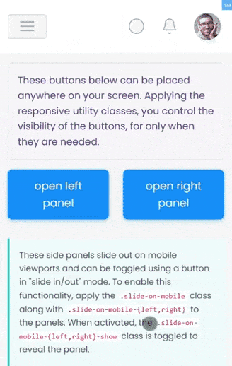
These side panels slide out on mobile viewports and can be toggled using a
button in "slide in/out" mode.
To enable this functionality, apply the .slide-on-mobile class
along with .slide-on-mobile-{left,right} to the panels.
When activated, the .slide-on-mobile-{left,right}-show class is
toggled to reveal the panel.
A backdrop is automatically inserted right after the closing tag of the
.slide-on-mobile container. Typically, this slide
panel is paired with .layout-trimmed and .set-nav-minified
for a clean and streamlined appearance.